Updated December 15th, 2015.
There’s this thing called “The Stock Market” where people with extra money place bets on companies, and if things go right they cash out with more than they went in with. It’s sort of like betting on the NFL, except it’s legal in every state, and harder to handicap, and if you lose you can always wait around and hope that someday things will turn around and you’ll end up winning. Anyway, Apple provides an app for Stocks on every iPhone, and this very day I “discovered” a couple of features I didn’t know about.
Let’s start with the basics: start up the app and you get this screen.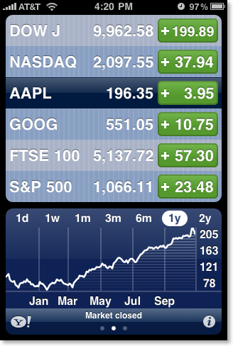
That’s pretty simple: you can see, for example, that AAPL (Apple) went up $3.95 today, and GOOG (Google) went up $10.75 today– a good day for both. But who had the better day, Apple or Google? Well, if you’re My Mom the Math Major (MMMM), you can work the percentages out in your head, and you probably already have. For the rest of us, a simple tap on a green button (of course, they might be red– that’s when it’s NOT a good day), and you see the day’s gain as a percentage, like so: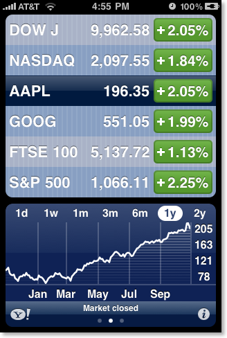
It was a better day for Apple than for Google, but not by much. They basically rose with the rest of the market.
Tap a green (or red) button again, and you get this strange looking bit of info– which turns out to be the “Market Capitalization” (or just “market cap”), the product of the share price times the number of outstanding shares. Wow, look at Apple go.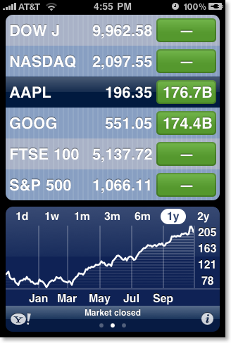
But that’s not the half of it.
See that little chart across the bottom? I’m sure you’ve figured out that you can touch “1d” to show the day’s ups and downs, “1w” to show the week’s, etc. But did you know you could swipe left (or right) to get to other screens, with more info? Yup, you can. Try it and see. Here’s what you get: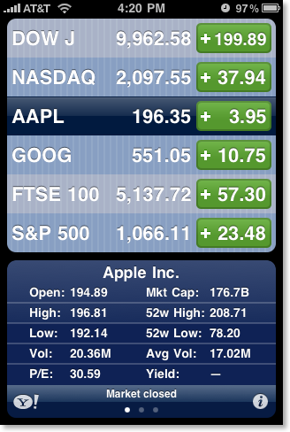
Swipe again, and you get a list of news article concerning the company. (In a nice touch, the three screens– chart, info, and news– go “all the way around” so you can keep swiping in one direction and come back around again to the beginning. Too bad this feature is missing on the iPhone’s Home screens.)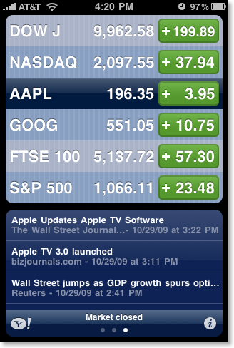
Touch one of the stories and you’re taken to the full story, in Safari. Here’s an example: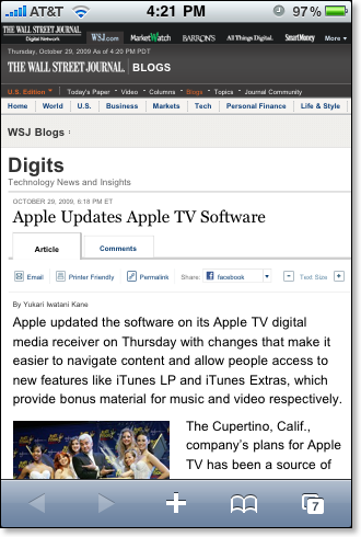
This would have been enough for me to write about, but then I tried rotating the iPhone while in the Stocks app, producing this: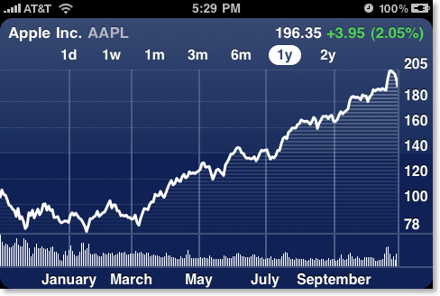
And THAT would have been enough for me, until for some reason I touched the chart, and then I touched it in two places, giving me THIS.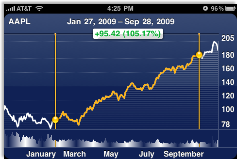
Amazing! Now it’s easy to see the stock’s performance: how much it went up, what that is as a percentage, and from when to when.
Try dragging your finger along the chart. It’s fun, especially if you own Apple stock! Note: if you swipe left or right on this screen you will bring up the chart for your next stock.
Much of this is new since iPhone 3.0, but that’s no excuse for only discovering it today! I guess I’ll have to spend more time turning the iPhone sideways and touching and tapping everywhere as I search for hidden features I should have known by now.
(Did you learn something here? Click the Share button and tell a friend! Did you know all of this already? Send me an email and tell me.)
Copyright 2008-2024 Christian Boyce. All rights reserved.
Did this article help you?
Maybe you'd like to contribute to theChristian Boyce coffee fund.

Want some some quick iPhone how-tos?
Visit me at iPhoneinaminute.com.
Looking for quick tips about Macs?
See my One-Minute Macman website!
Please Leave a Comment